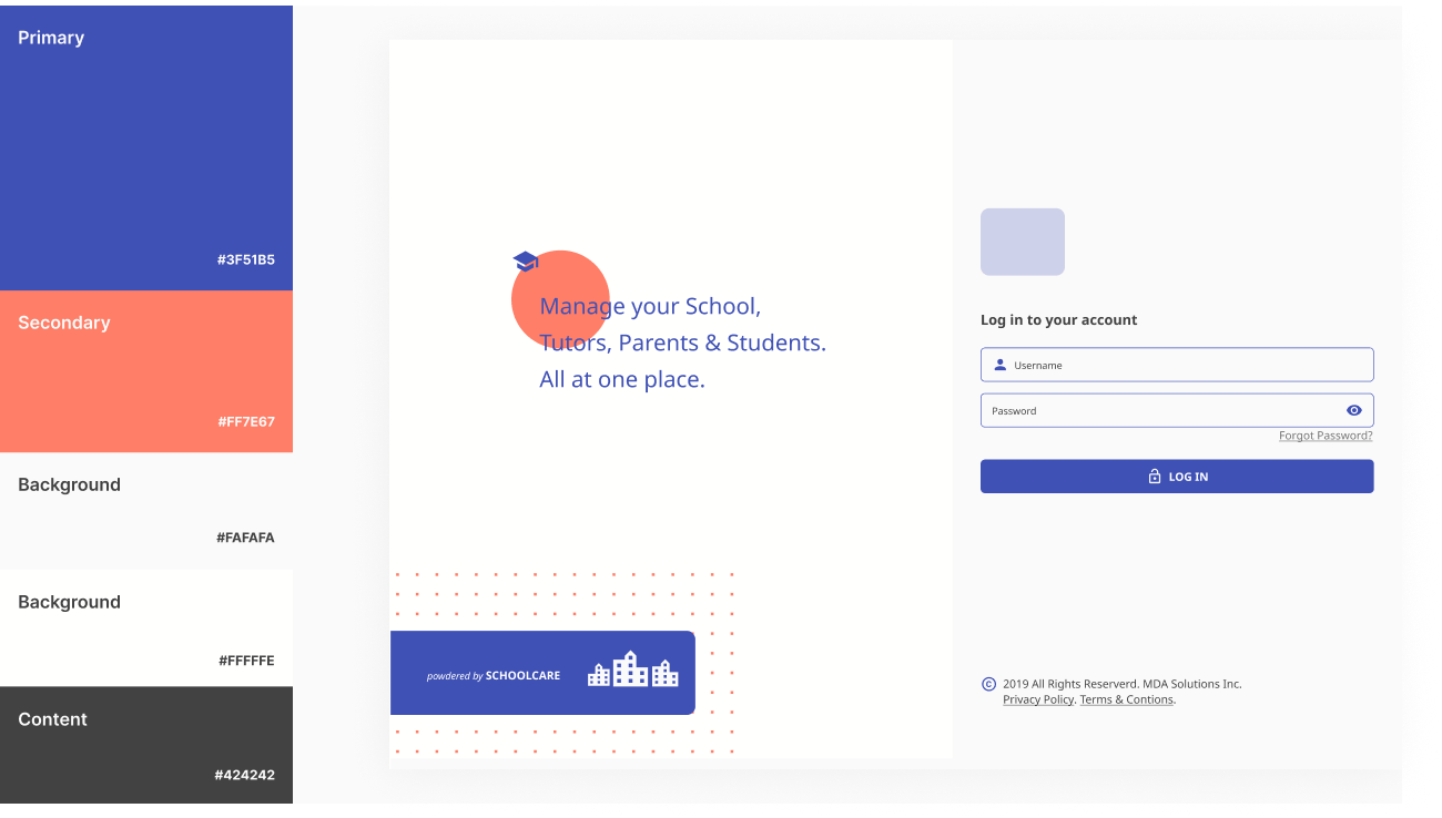
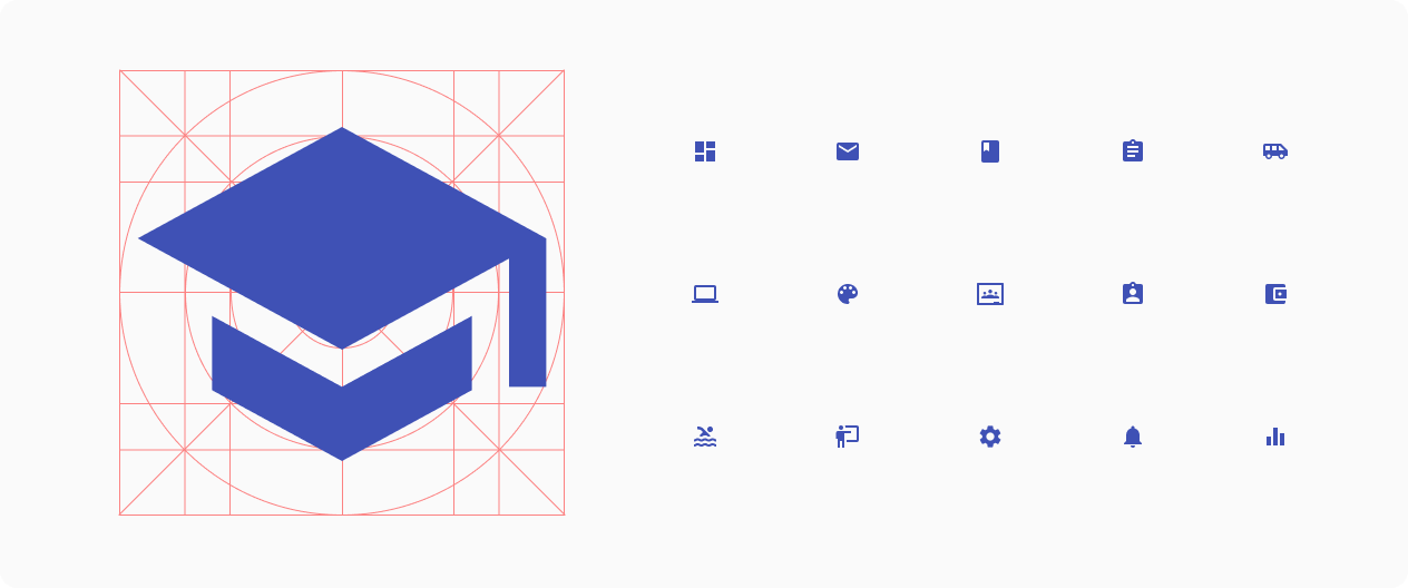
Schoolcare
UX/UI
Client
Schoolcare
Industry
Edu-Tech
Introduction
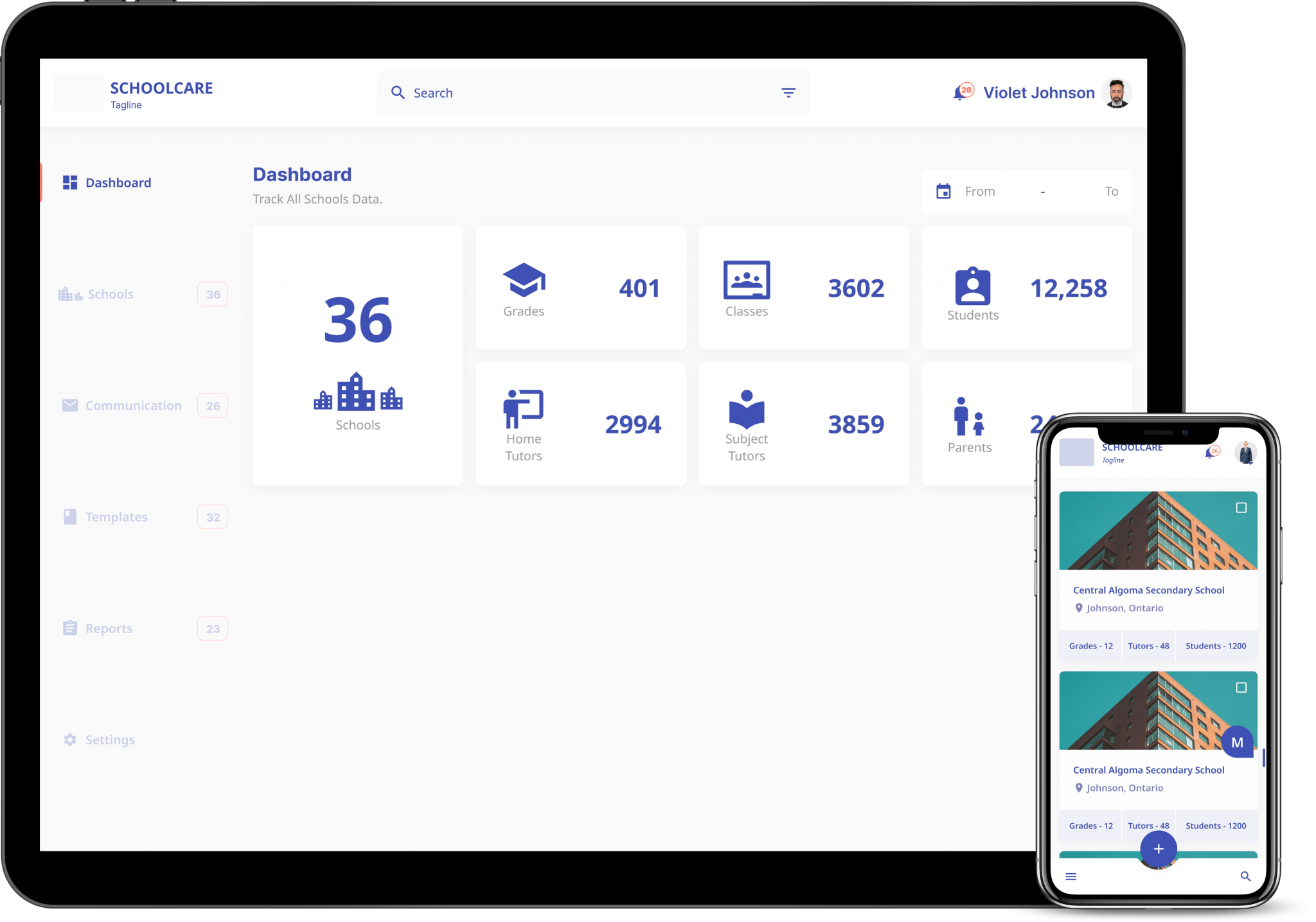
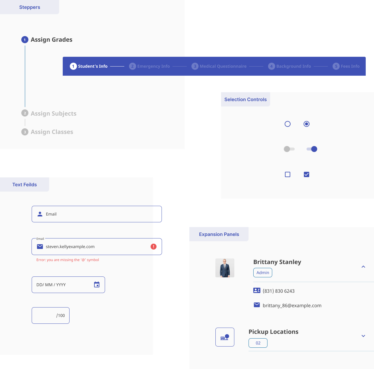
#school management application
A school management application that helps different stakeholders like school Admin, tutors and
parents to perform their daily tasks with an easy to use digital platform and keep the track of
the child’s progress.
Although this application initially based on user behaviors of Canada, it is optimized for
future scenarios where it can be used for other parts of the world.