TimeKeeper
A mobile application designed for employees to fill the timesheet and maintain the hours and projects in a clean and intuitive way.
Problem Statement
Everyone likes to procrastinate filling timesheets as it is never an enjoyable experience. It’s a challenge to remember the details of time spent on various official activities. You need to design a mobile app called TimeKeeper, that will help your colleagues to fill in work hours accurately and efficiently on a daily basis and the user can share the timesheet.
You should give them an option to edit the hours if they have made any mistakes. They will also receive a gentle reminder if they have missed to fill in the timesheet for an event which is already present in their Calendar.
Ideation
- I want to keep it as simple as possible.
- The job/project is assigned to an employee by his manager/supervisor and she/he can fill the timesheet by updating the amount of time it took with a task/comment.
- All the updated timesheets will be frozen and can’t be editable after a certain timeframe, maybe a day.
Design Challenge
Why do we need to do any other timesheet app which is not different from the available ones in the store, rather than changing the UI from existing apps we should make it more engaging and fun.
How to Solve?
- List of all tasks on user’s home screen for quick-access to the list of projects with Ongoing and updated.
- Design user experience optimised for organising updated and On going.
- Design user interface with a gamified perspective to make the experience more enjoyable.
- By doing so, we make sure users save their time and feel timekeeping more fun.
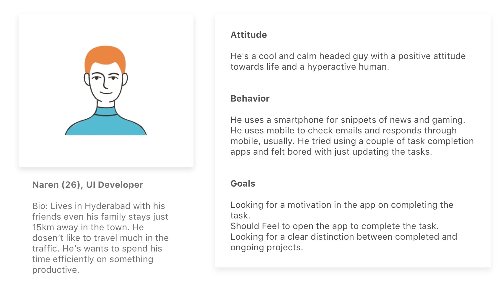
User Persona:
Our Objective is very clear. Employees should fill in timesheet without feeling bored, pain and especially fill it timely. I created some persona of potential user based in online researches and experiences of my friends who usually fill in timesheet.
User Flows
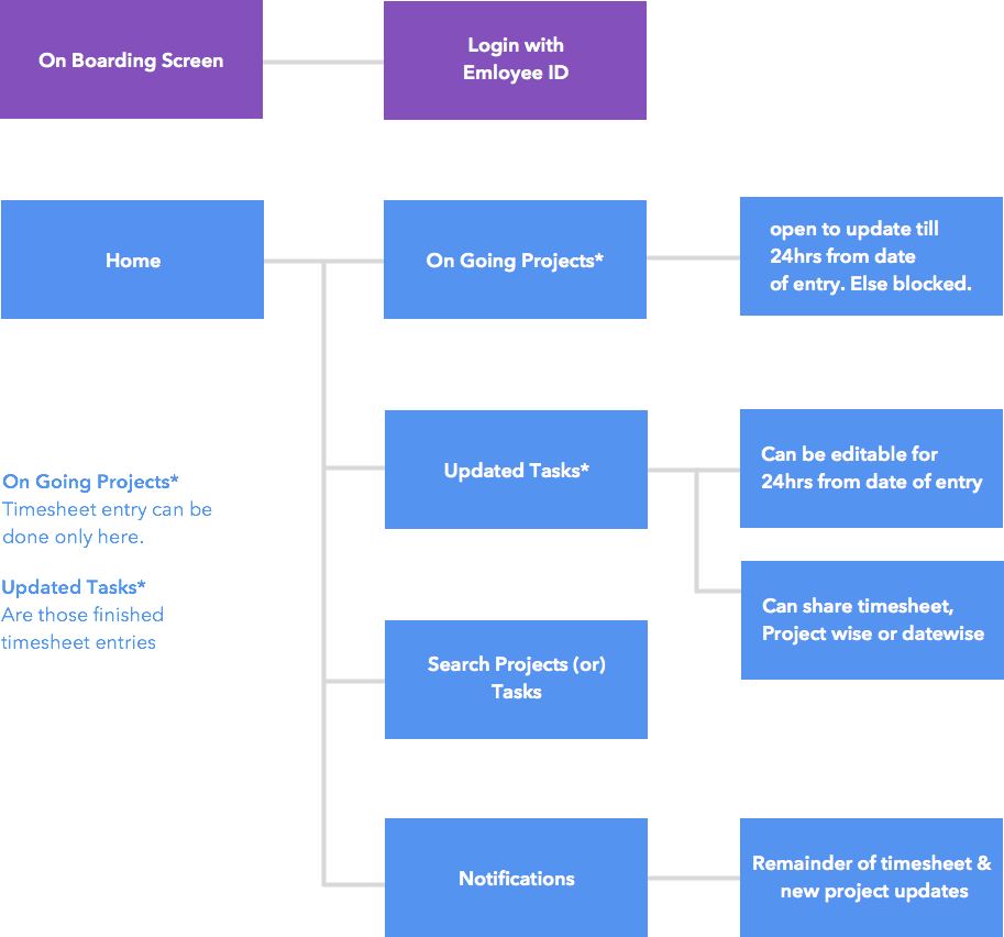
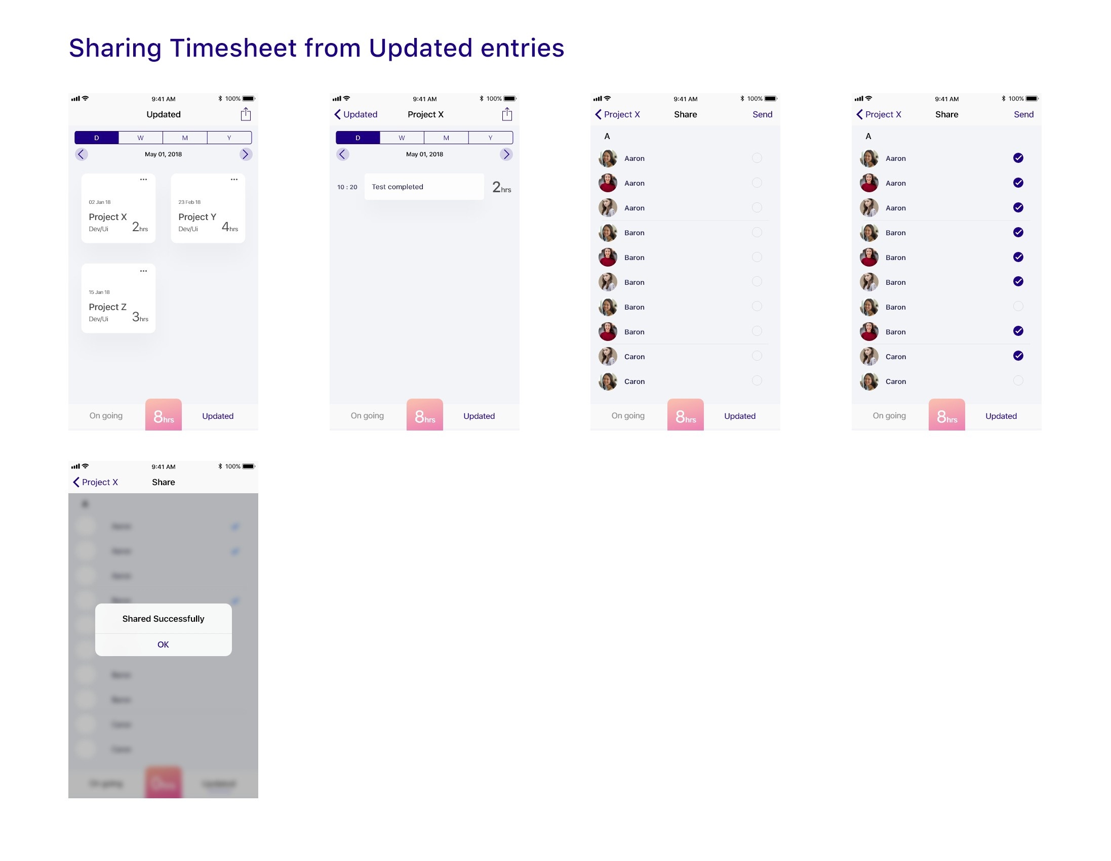
Made a chart for User flow to make sure we land up doing appropriate wireframes. The most important feature of this application is to understand how to update a timesheet using a game like a model and by removing annoying steps. To have a great experience the sorting of ongoing projects to updated one’s and make the app more helpful & quick to share the timesheet for the day, week, month and year.
Lo-Fi Sketches
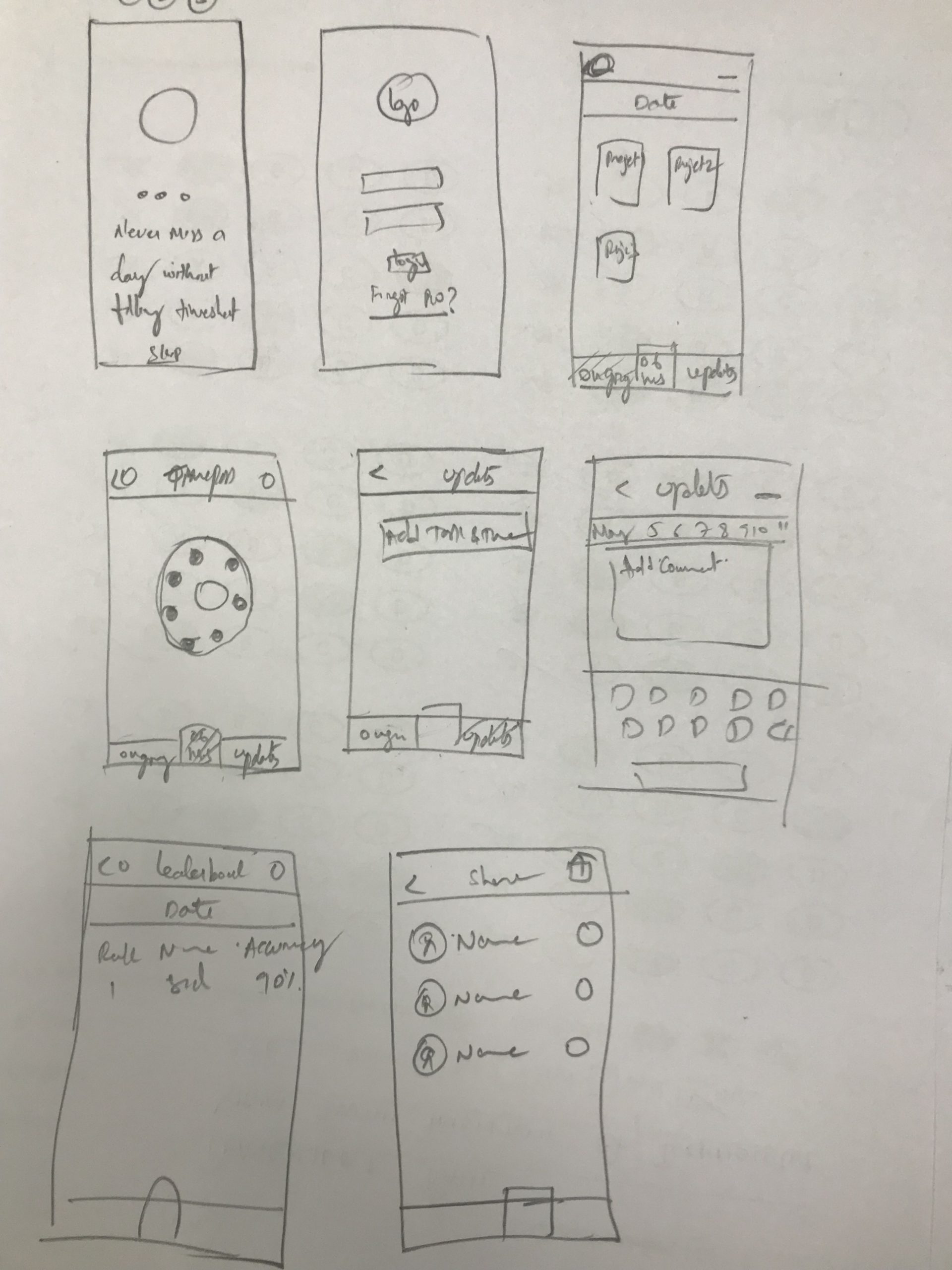
I created some rough wireframes on paper before I started with wireframes. I decided to follow Complexion Reduction in entering the data or user interaction. So the user gets to do what he wants and with a clear call to action.
Wireframes:
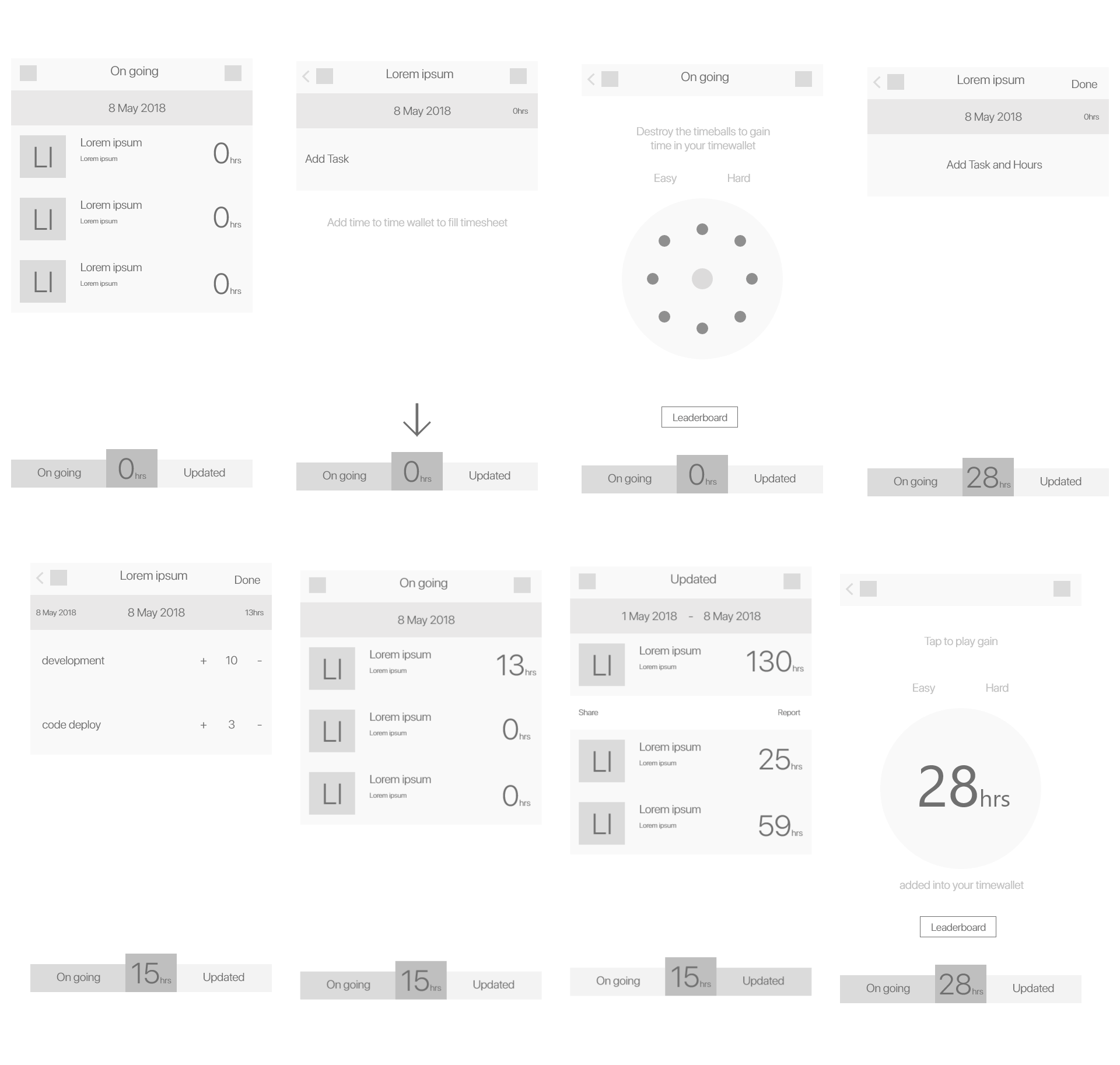
Based on the sketches, created wireframes and this actually helped us to do user testing, we did test it by asking random people to check out the app and got a clarity on many issues.
Pain Points
Based on the feedback, I redesigned some of the features and other elements. The below are the details and we rectified the pain points in the visual design stage.
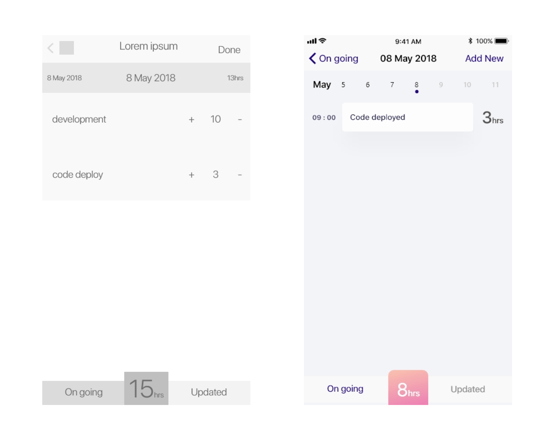
Pain point 1 :
Looking at the calendar design the user was not sure on how to change the date or access other dates.
Pain point 2:
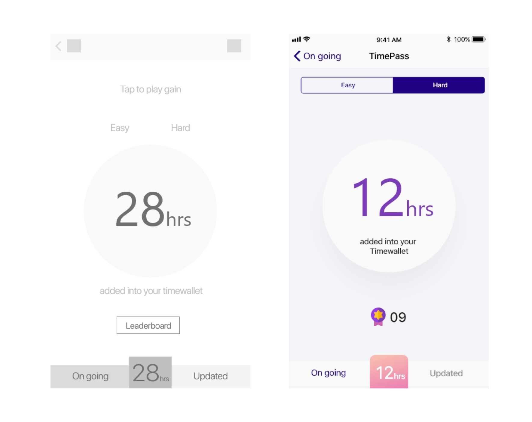
Initially we had no limit to add hours in the game, not giving time limit to add didn’t make any sense to our initial approach. So user can add incrementally up to 24hrs at any moment.
Why a Game?
We did research on available timesheet apps, we have understood that there is a scope to procrastinate time filling for a week, month or until completion of a project.
In the research, we understood that it’s tough to recollect the food they had the previous morning. So we assumed it would be quite tough to remember or recollect the amount of work that has been done after a day or a week.
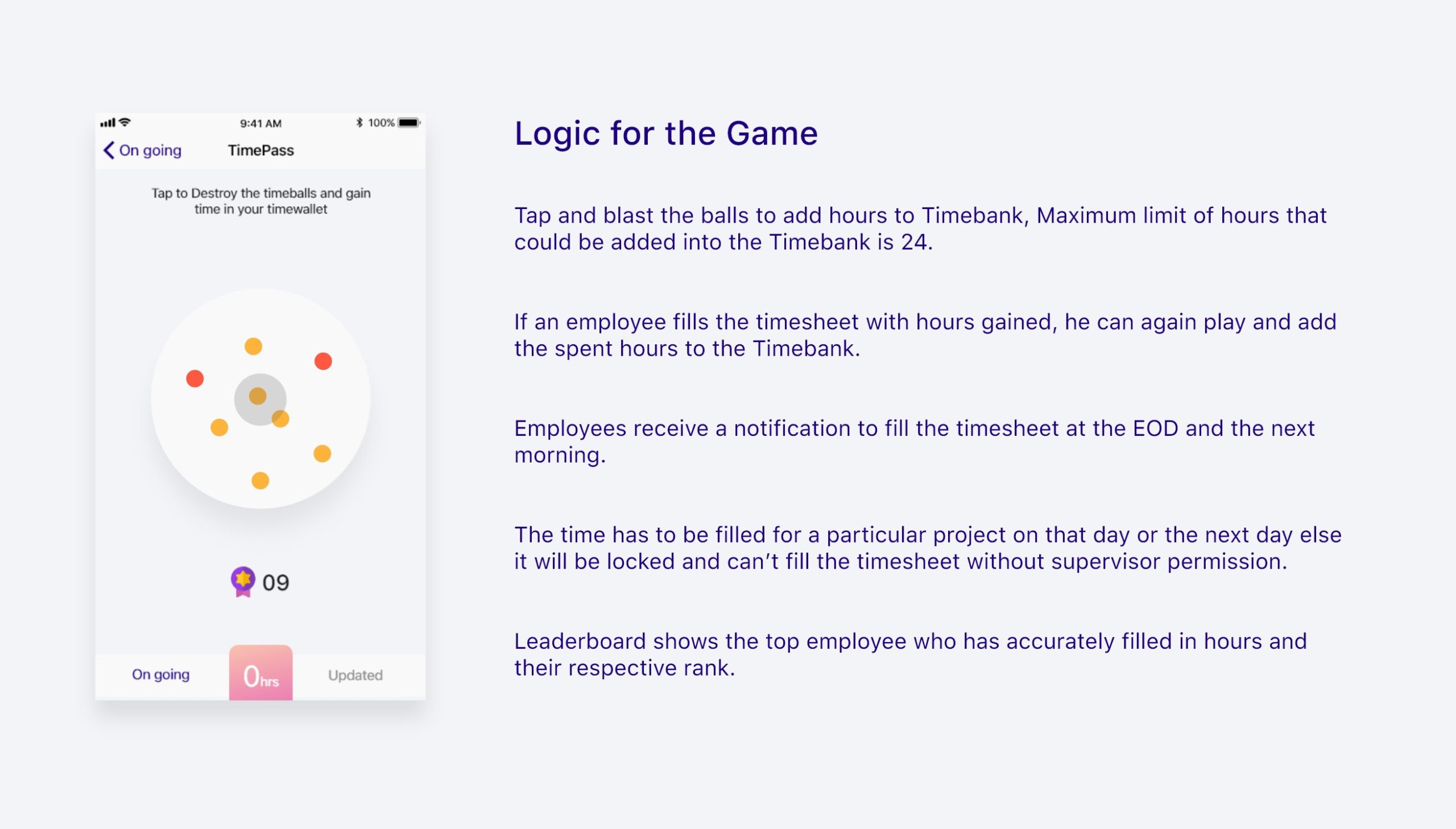
To provide a solution to the above-encountered problems we thought of giving a restriction of the time on updating a specific task/project. For this, we gave the control to the user through a game, where he can add up to 24hrs at once to TimeWallet and using that he can fill the timesheet. Once he uses the hrs from the wallet he can refill by playing the game and add up to 24hrs.
Logic for the Game:
Visual Design
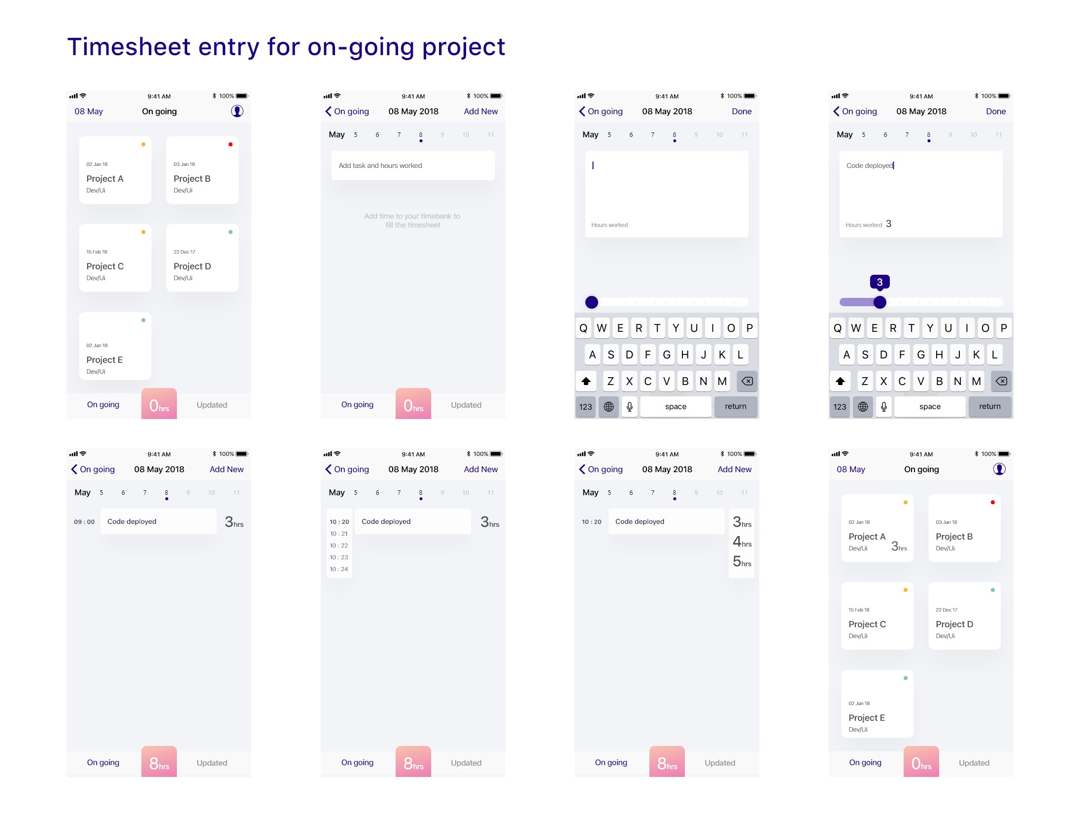
After Sketches, wireframes and User Testing, I sat on the visual design part by enhancing the features and design based on the user’s feedback and challenges.
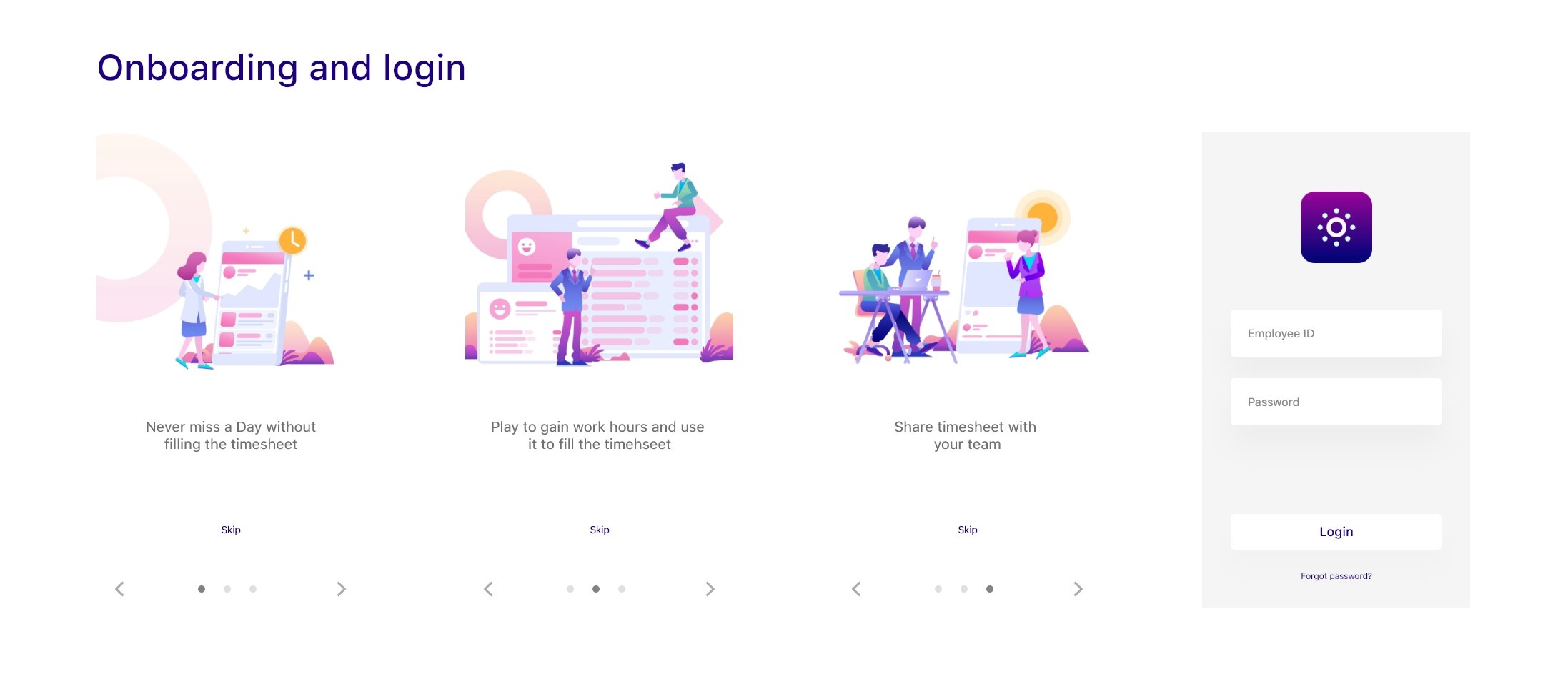
the artworks on the on-boarding screen are just for reference and credits are unknown.

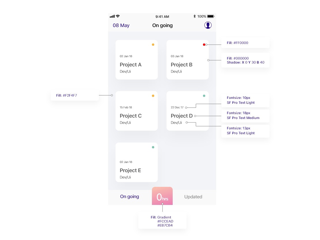
Style Guide
App Icon
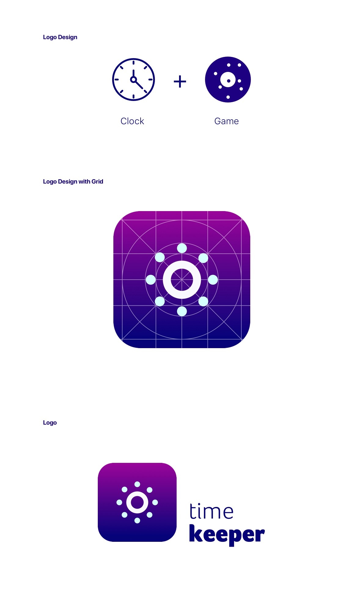
TimeKeeper
The design of this app is to make sure employees/users enjoy the process of time filling. We gave restricted access to the user and should be cautious to make mistakes when filling timesheet.
Thanks for reading till here. This is a concept app done in five days. Please check out my portfolio on Branding and UI/UX below. Have a great day.
Say Hello
We at HelloFello do strategic design and implementation to help you achieve a greater goal. Let’s talk and explore on how we can be the catalyst in your product success.

